
Earlier in my portfolio, you may have come across the previous Auto Cure branding and website design I worked on in 2016. Since then, my personal style has developed significantly, and with that much more experience I decided to take on the branding and visual identity again.
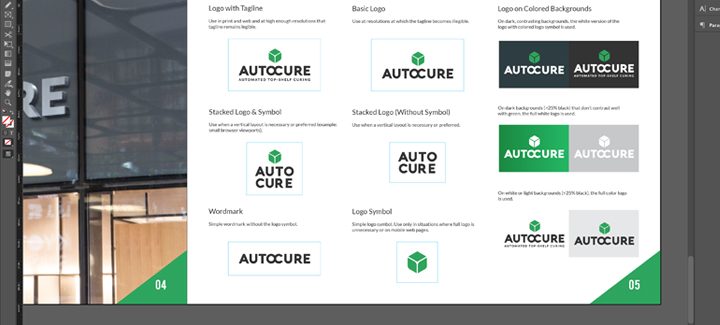
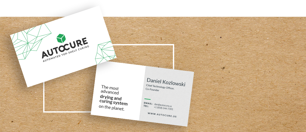
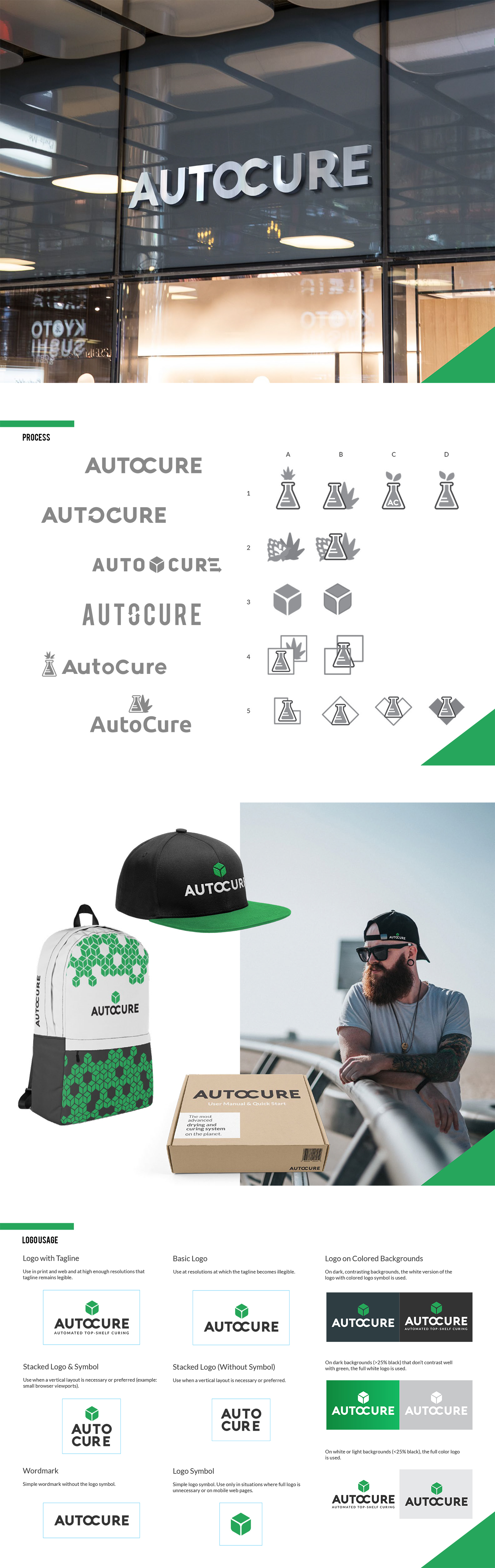
This logo combines the two letters in the center (O+C) to form a new shape that represents “all-inclusive” and “self-contained.” Connecting these letters balances the logo shape and plays on the symmetry of the 8-letter name. The font choice is modern and industrial, yet approachable due to the slight curvature on the legs of letters A, C, and R. The logo uses the “leaf box” symbol when applicable, but can also stand on its own.
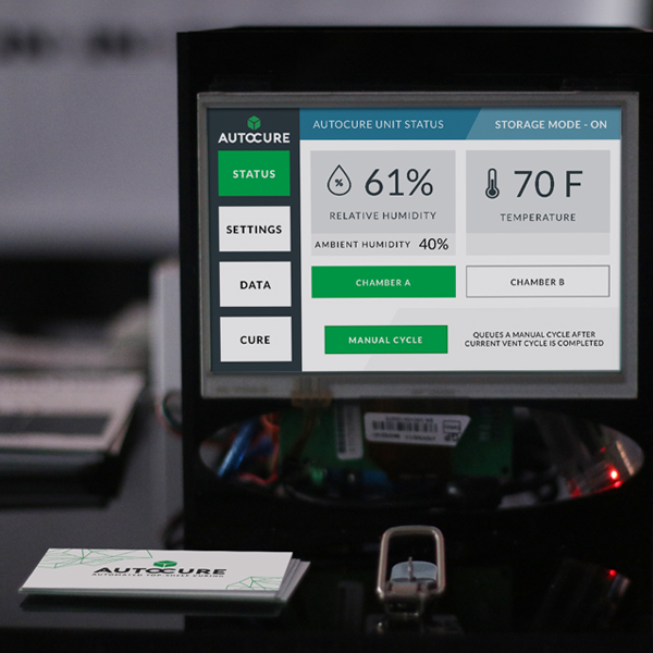
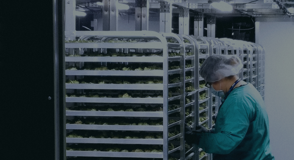
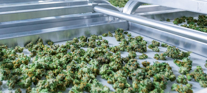
The primary logo symbol, what I call the "leaf box," represents a highly simplified metaphor for Auto Cure, a self-contained environment which can be controlled and set to the ideal temperature and humidity for moisture release of cannbis flower during the curing process.