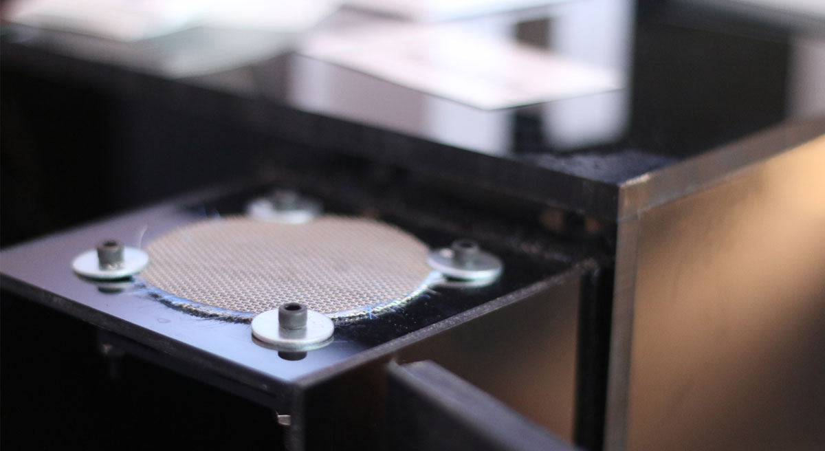

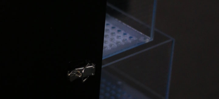
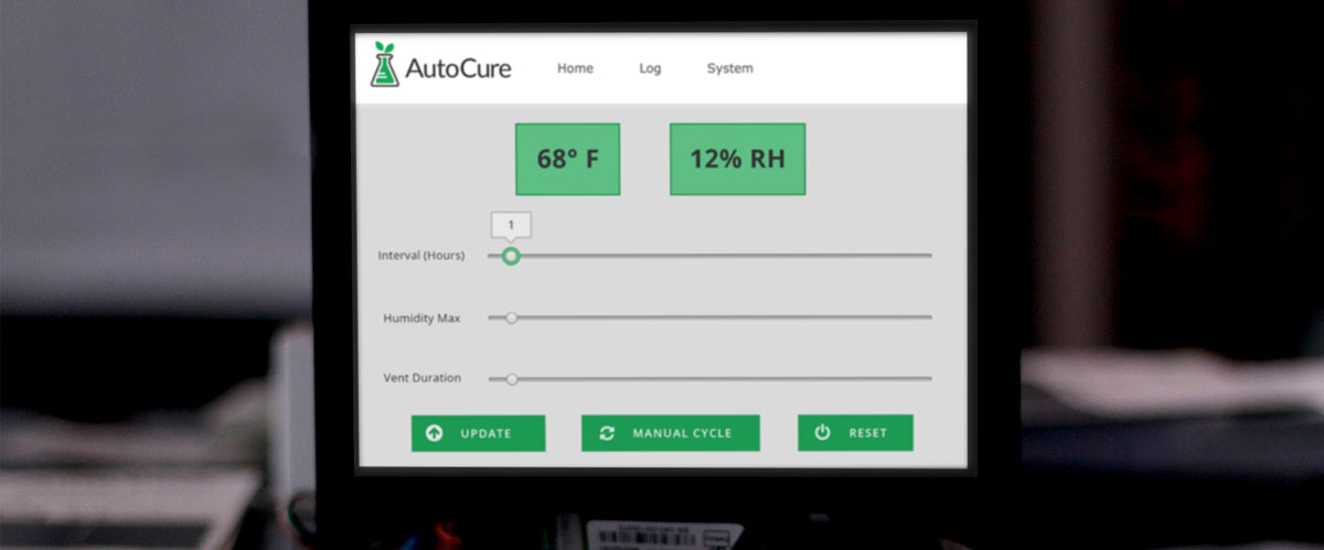
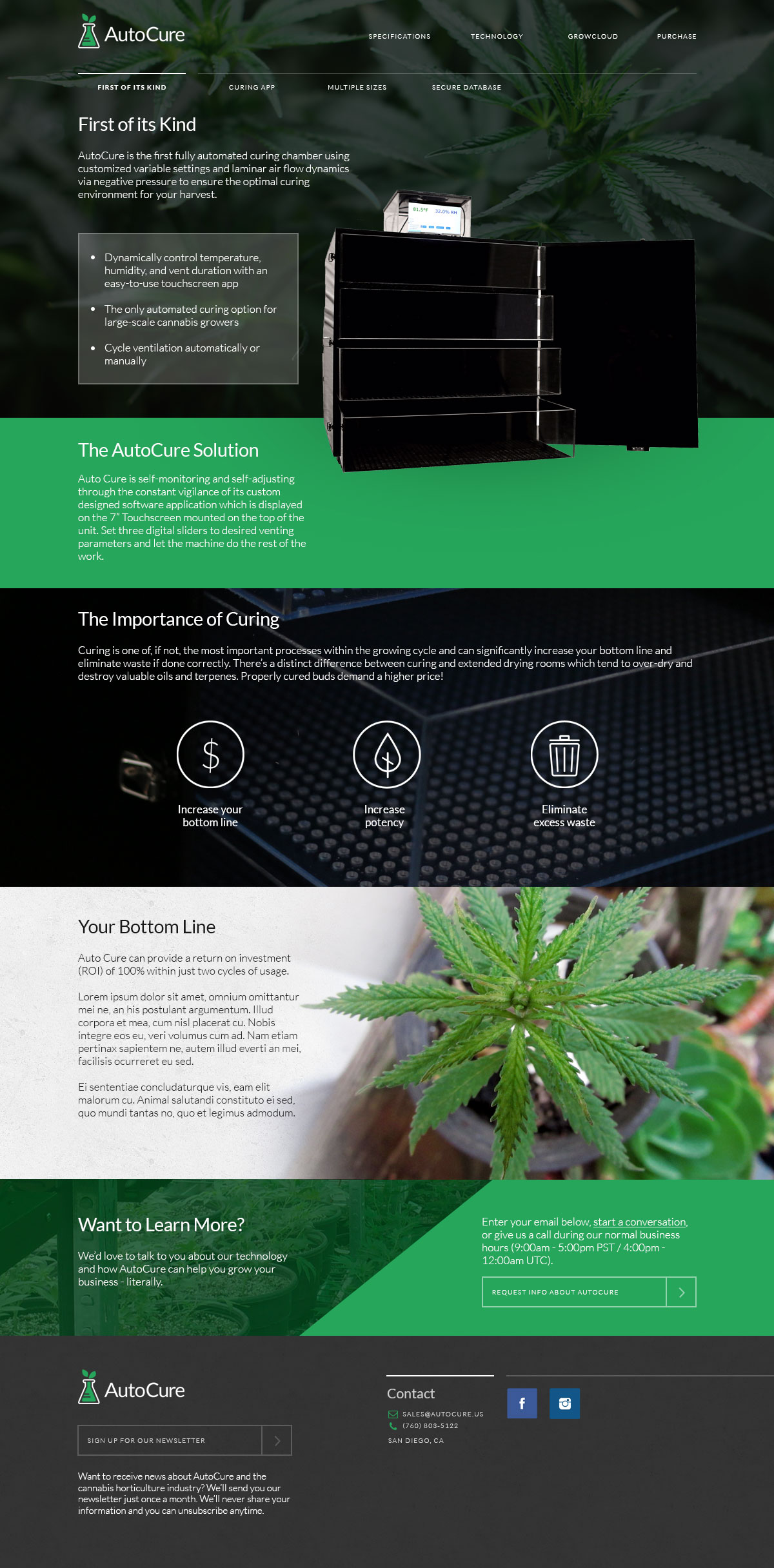
AutoCure produces fully-automated curing chambers used during the process of cannabis production. I was brought in as a creative lead to design a brand identity, design and develop the website, and create an interface for the touchscreen app.

In creating AutoCure's brand identity, I chose the Lato font family for its versatility and modern feel. I built a color scheme around a pale, flat green #3db66e (61, 182, 110) and created a logo that combines the technical and scientific foundation of the company with the natural characteristic of the final product.
Before I put the pen tool to digital canvas, I set about uncovering the main and secondary goals of the website and creating basic user flows. I put together a collaborative Google Doc where I shared my thoughts and ideas with other members of the project to make sure I correctly understood the project's scope and users.
This project is still in-progress and the final site design will be uploaded at its completion.