We set out to revitalize Crelate's visual identity in a manner that stayed true to the principles that distinguish our product as an industry leader. Our guiding motif for this project was "balancing startup playful with enterprise polish." Our intent was to modernize and evolve the brand - make it one that is fresh, playful, and also built to last. We wanted to ensure that even with aesthetic change, the spirit and substance of Crelate remained unmistakable.

We began the process by looking at industry competitors and design languages that were aspirational. Initially, I put together 5 color palettes along with various imagery styles to get an idea of the approach and direction that we could take the brand. I took the two that I felt were the most compelling and created stylescapes that explored how the brand identity could feel with a bit more polish. Unexpectedly, we scrapped both.
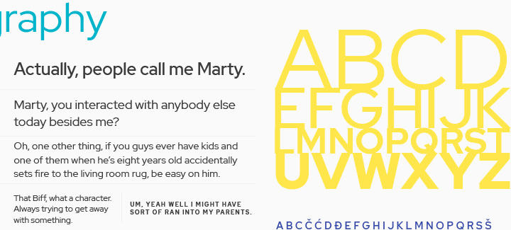
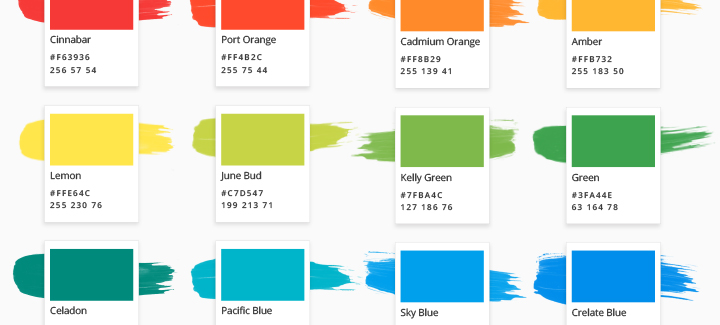
Instead of choosing a color palette of primary, secondary, tertiary, etc. shades, we decided to say screw it, let's not limit ourselves — and chose 16 colors. 😂 From there, things fell into place as we took elements in our software to inspire and guide stylistic decisions.